Email campaigns
Because the business operated on a subscription model, customer retention was everything. To strengthen engagement with our subscribers, I initiated a series of educational emails about women’s health - both general topics and those specific to pelvic health (NeuEve’s field).
My colleague suggested adding quizzes to deepen learning, so I took the lead on crafting emails that would actually get opened, read, and clicked. The goal: create content that feels valuable, builds trust, and guides women to the quiz seamlessly.
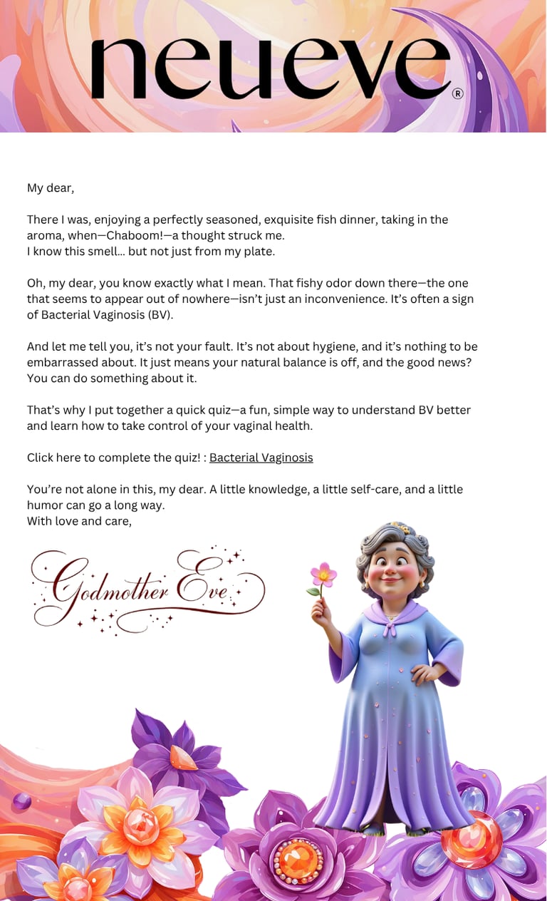
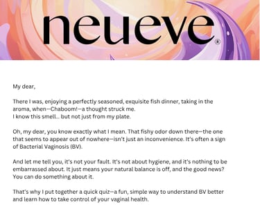
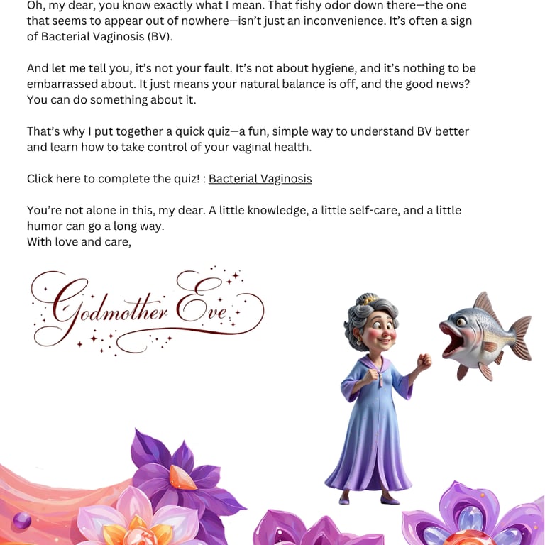
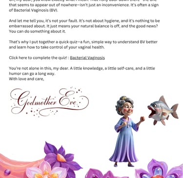
Season 1: Godmother Eve
With a lighthearted, fairy godmother voice, these emails were designed to gently “break the ice” for women entering the world of vaginal health. Comical, caring, and warm, they helped ease anxiety around taboo topics like BV and menopause — while guiding readers toward simple, quiz-based education.
Season 2: RIP Eve
A lot of people loved Eve. But some were offended - they mistook the Godmother (who we intended as a comforting caretaker figure) as a representation of our customers. They pointed out that 60–70 year olds don’t see themselves that way, and felt the character aged them unnecessarily.
It taught me an important lesson: don’t get too attached to your ideas. What matters is how the customer sees it, not how much you love it. Our audience wanted to feel empowered - so we moved on to a more modern design.
These were...
Well...
A tiny bit lengthy.
In the pursuit to make the emails as informative and valuable as possible, I lost sight of the main goal: driving readers to our educational quizzes. Feedback improved - customers appreciated the tone and detail - but clickthrough rates dropped sharply.
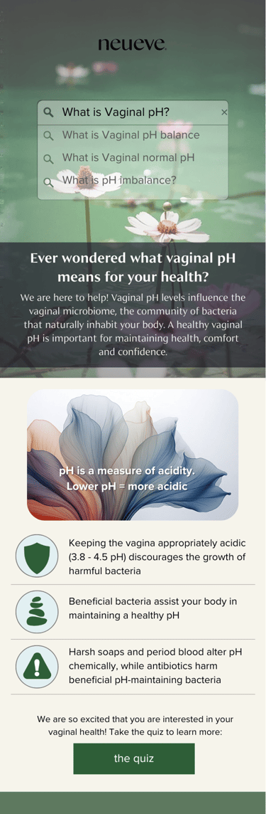
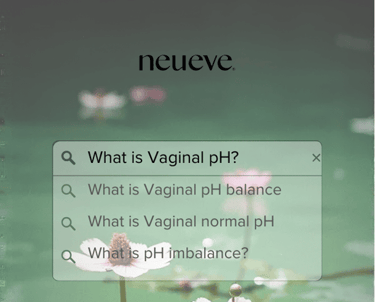
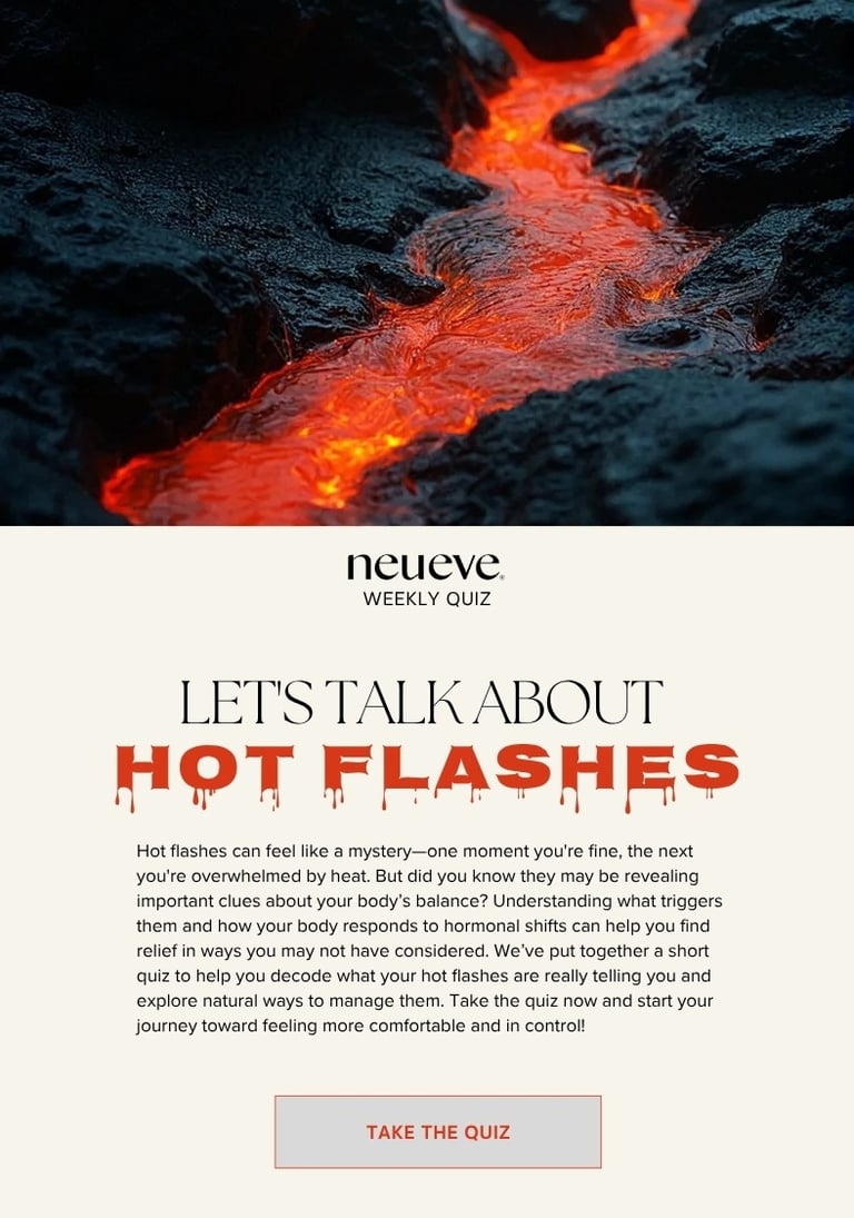
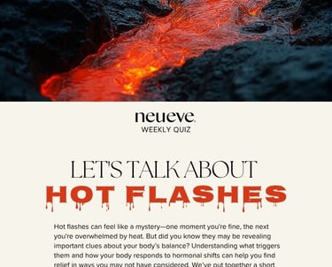
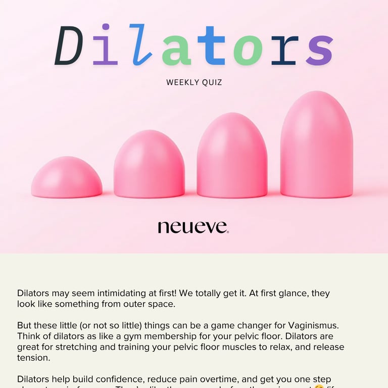
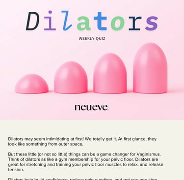
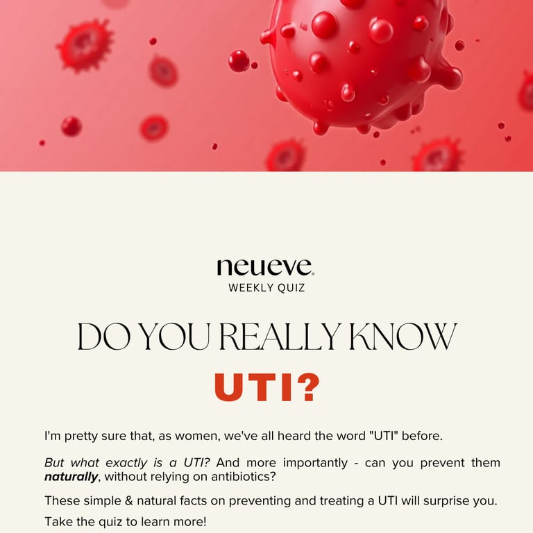
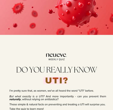
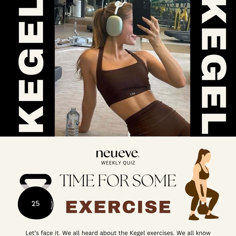
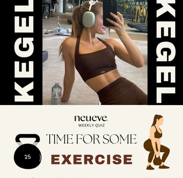
Season 3: Balance
After rounds of testing and feedback, I reached Season 3 of our email campaigns - the sweet spot. The tone felt empowering, the visuals were bold, and the structure finally did what it needed to: educate and convert.
Gallery
Insights
Expert marketing strategies for small businesses and startups.
Portfolio
Contact
ayala.batanovva@gmail.com
+7478205039
© 2025. All rights reserved.